

Foodie Fanatic
A digital transformation roadmap for a brick and mortar cooking supply retailer.
Project Overview
Our client had over 20 years of experience as an industry leader in specialty cooking supply retail and was preparing to transition into an online community-based platform connecting foodies of all skill levels, geographies, and culinary interests. The company, known for its customer service and insightful product knowledge, sought to shift its clientele to its web app and online shop as it began the process of closing its brick-and-mortar stores across the nation.
Our team proposed a multi-phase action plan to help Foodie Fanatic fulfill its company mission and reach its vision of becoming a global community for food lovers, created by food lovers. The scope of this project was Phase 1 only with consideration for Phases 2 and 3.
Phase 1: lead the complete digital transformation of Foodie Fanatic’s educational and shopping experience.
Phase 2: expand brand awareness by increasing local presence through special events
Phase 3: facilitate community-oriented food tours.
We developed the foundation for a revamped web app supported by information architecture, taxonomy, and content strategy informed by data-driven user research.

User Research
Based on feedback from users, the current Foodie Fanatic website was:
Confusing in purpose
Difficult to navigate
Cluttered with irrelevant information
People said:
“The search function doesn’t give me relevant, useful content.”
“I can’t find what I need so I have to go somewhere else.”
“You have classes? Where is that? I never saw it.”
“I don’t want simple recipes. I’m looking for something more sophisticated.”
We built the Foodie Fanatics community on a new web app which was a:
Shopping platform connected to web app and stores
Resource for recipes, instructional videos, and local classes
Community to share cooking experiences through photos and reviews

My Role
This was an intensive course with a very short timeline. Our team worked closely for the duration of the project, but as information designer, my focus was on building the user flow and annotated wireframes. Other work was divided between a business strategist, a content strategist and a taxonomist.
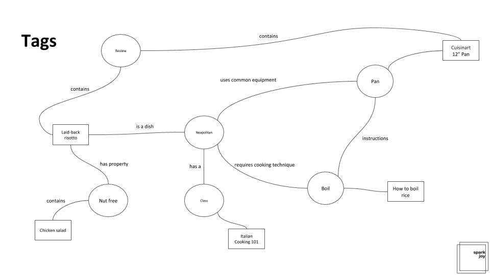
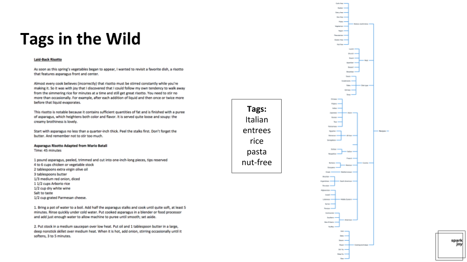
Information Organization

site map

taxonomy
Wireframes
Knowing that our app would have three main components, I produced annotated wireframes which addressed the experiences of Make (recipes), Buy (eCommerce) and Learn (registration for in person and online classes). I also wanted to explore how and where these three categories could overlap and what the experience might look like for signed in vs guest.
Homepage: logged in and guest states

1 Foodie Fanatic logo: Clicking logo will bring users back to the homepage; logo is persistent across app with exception of product or recipe detail pages.
2 Search bar: Search persists in global space across app on all pages except for details pages.
3 What's Cookin' search box: Users are greeted by the hero ad on homepage offering another option to search based on their current needs.
4 Make, Buy, Learn ads: Directly below the hero ad, the three priority categories are represented and upon clicking, members will enter into one of the three flows.
5 Advertisement: This drop zone is available for sponsored content, paid for by advertisers.
6 Top Trending Recipes: This carousel dynamically pulls in top trending recipes from the internal server.
7 Bottom Navigation: Home, Lists, Alerts, Cart, Profile are persistent through app experience.
8 New products: New items dynamically populate in this carousel as they come online.
9 What's Cookin' search: Logged in customers will see their name in the main search box.
10 New recipes: Personalized content based on browse and purchase behavior will be served to users.
11 Recommended for you: Personalized content based on browse and purchase behavior will populate dynamically in carousel.
Search from homepage

1 Search Box in hero ad: Users enter keywords into search box.
2 Keyboard: Keyboard is present while users are typing in the field only.
3 Results: After user clicks 'return', a results page of related items populates based on search term.
Recipe detail page

1 Recipe image: Photo of what final dish should look like.
2 Reviews: Stars with number of reviews in parentheses will anchor to Reviews section below.
3 Recipe details: Details include a description, Prep Time, Cost Time and Servings.
4 Drop down detail navigation: Drop downs include full ingredient list, recipe and reviews.
5 Instructional video: If available, an instructional video of the recipe will be available.
6 Your Photos: User-generated content carousel of prepared dishes. These would be moderated by the Eat Out team.
7 Recipes recommended for you: Carousel of similar recipes - parameters may be changed to similar dish size, cuisine, ingredients, etc.
8 Product: Product needed for preparation of selected recipe that is available for purchase on the app.
9 Customers have also purchased: Carousel of products that have been purchased by customers interested in this specific item.
Product detail page

1 Product images: Carousel of product photos and videos.
2 Reviews: Stars with number of reviews in parentheses will anchor to reviews section below.
3 Add to Cart: User will add product to cart when button is tapped.
4 Add to List: Logged in users will add product to saved list when button is tapped.
5 Drop down detail navigation: User can learn more about item from product details, specifications, reviews and question & answer drop downs.
6 Related recipe: A recipe using the product will populate below product information.
7 Recommended for you: Carousel of similar products.
8 Customers have also purchased: Carousel of products that have been purchased by customers interested in this specific item.
“Buy”: homepage to product listings page

1
1 "Buy" category selected: User taps "Buy" and the box is highlighted in a different color to confirm selection.
2 Make listings page: All available products are on this page, with options for the user to filter and sort.
3 Select "Filters" button: When tapping "Filters", the box is highlighted before directing to next page.
4 Filters: All filters related to Products populate in list with each category providing the option to select more granular filters.
5 Filters by Category: Filter selection highlights when tapped and user is taken to next page.
6 Back arrow: Once within a category's filters, the company icon in the top left is replaced by the back arrow so users may take one step back as opposed to going back to the Home screen.
7 Filter by Subcategory: A list of options within the selected filter allows users to choose more than one subcategory. In "Cookware" for example, users can select multiple preferences.
8 Filter by Subcategory: Subcategory filter selections are highlighted by checkbox and user must tap "See Results" before viewing their options.
“Learn”: homepage to class listings

1 "Learn" category selected: User taps "Learn" and the box is highlighted in a different color to confirm selection.
2 Learn listings page: All available classes, events and instructional videos are on this page, with options for the user to filter and sort.
3 Select "Classes" button: When tapping "Filters", the box is highlighted before redirecting to next page.
4 Filters: All filters related to Classes populate in list with each category providing the option to select more granular filters.
5 Filters by Category: Filter selection highlights when tapped and user is taken to next page.
6 Back arrow: Once within a category's filters, the company icon in the top left is replaced by the back arrow so users may take one step back as opposed to going back to the Home screen.
7 Filters by Subcategory: A list of options within the selected filter allows users to choose the city where they'd like to take a class. WIthin "Seattle" for example, users can select multiple preferences.
8 Filter by Subcategory: Once a selection is made within the available filter selections are highlighted by checkbox and user must tap "See Results" before viewing their options.